


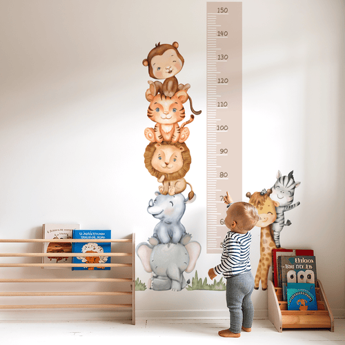
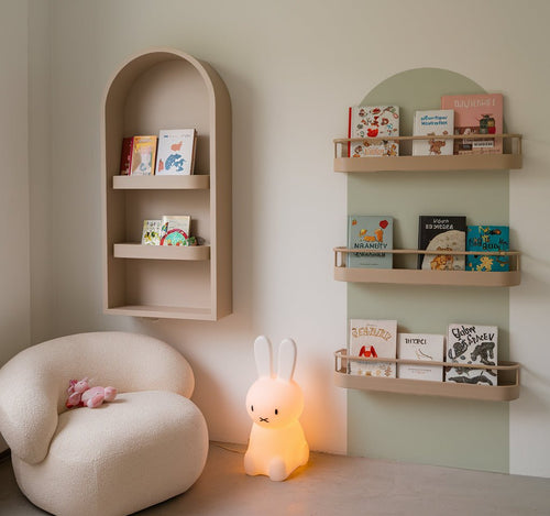

Compare rainbow and dreamy pastel stickers
Trying to choose between cheerful colour and soft, dreamy tones? To Compare rainbow and dreamy pastel stickers, start with the feeling you want the room to have. Rainbow designs bring playful contrast and visual energy, while pastel designs create a gentler, quieter backdrop for sleep, cuddles and calm play.
Key Takeaways
- Rainbow stickers bring lively contrast and visual energy, making them a great fit for active play zones.
- Dreamy pastel stickers create a soft, calming backdrop that supports sleep, cuddles, and quiet play.
- Your choice should match the primary mood you want the room to have, whether energetic or serene.
- Mixing rainbow and pastel elements can give you a balanced space that feels both playful and restful.
There isn’t one right choice for every nursery or playroom. Your wall colour, natural light, furniture and child’s current style all matter. As a parent-led design team, we find the easiest decision comes from imagining the room at its busiest and calmest moments, then choosing the palette that supports both.
Rainbow vs Dreamy Pastel Stickers: The Quick Answer
What Are Rainbow Wall Stickers?
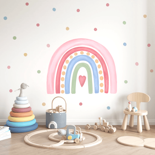
Rainbow designs usually combine several clear shades, such as pink, yellow, blue, green and orange, in a repeated motif or cheerful scene. They can make a plain wall feel more playful without the permanence of painted stripes or patterned wallpaper. The stronger colour contrast is especially useful in a play corner, reading area or shared room where you want a clear point of interest. For babies, contrast can also be visually engaging during the early months, while developing colour vision gradually becomes more varied throughout the first year. Keep the brightest designs where your child plays, rather than directly beside the cot.
What Are Dreamy Pastel Wall Stickers?
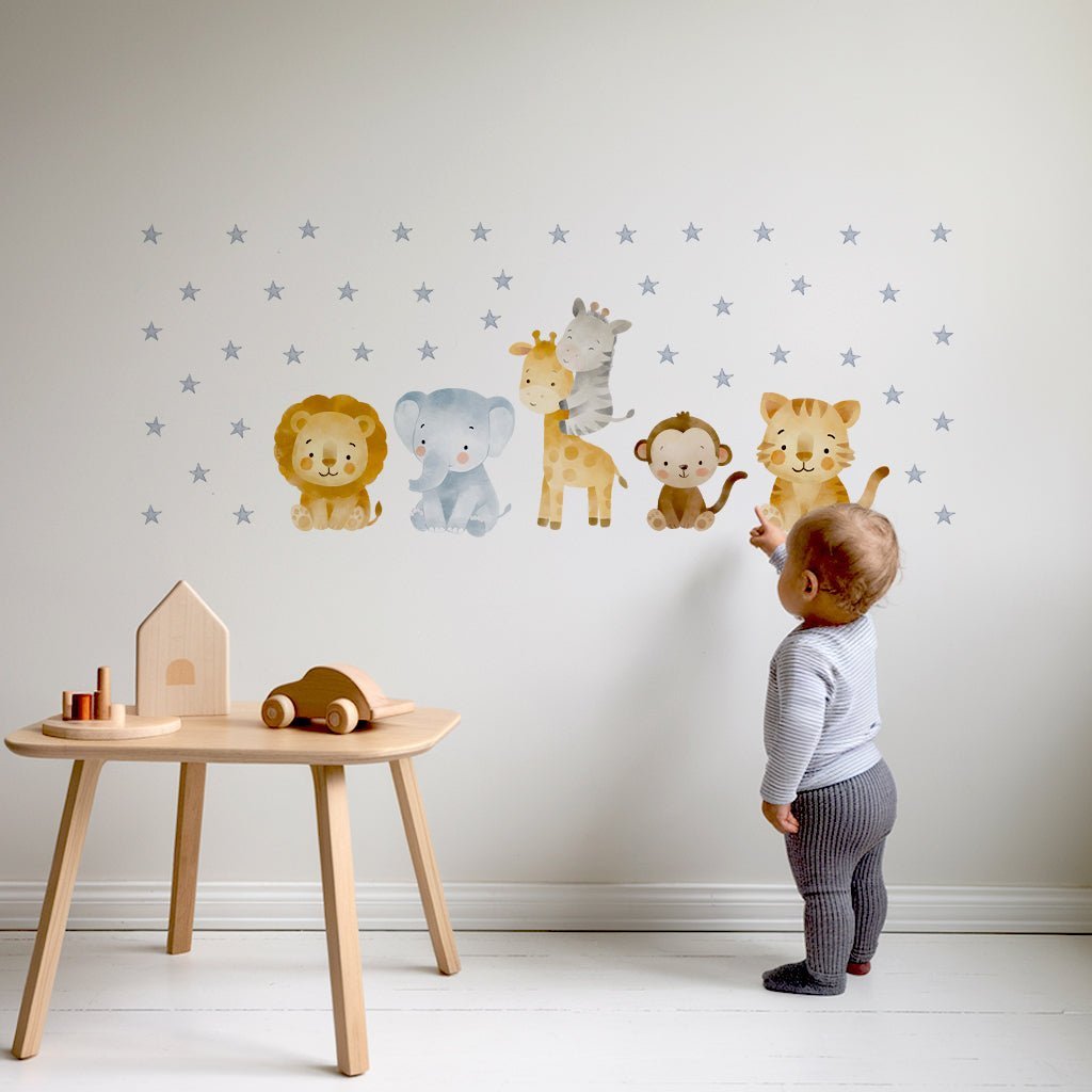
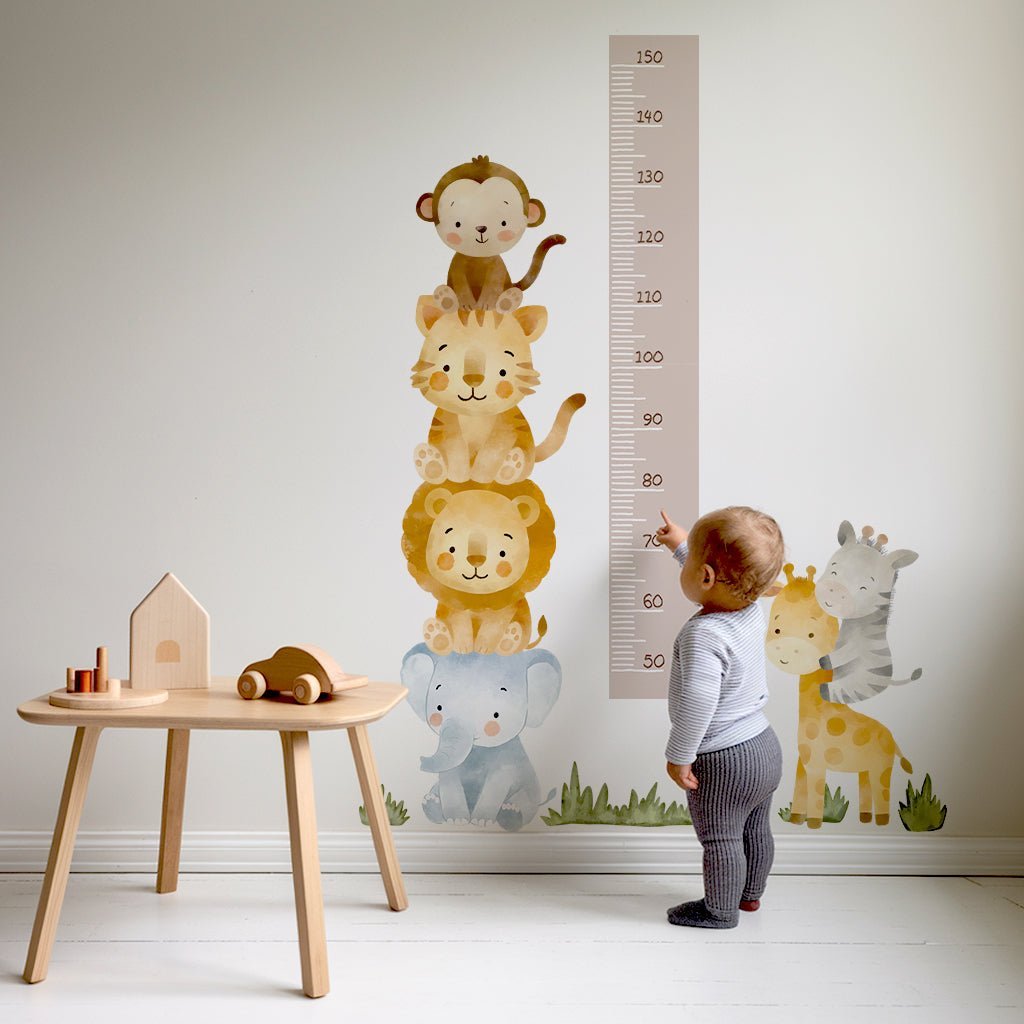
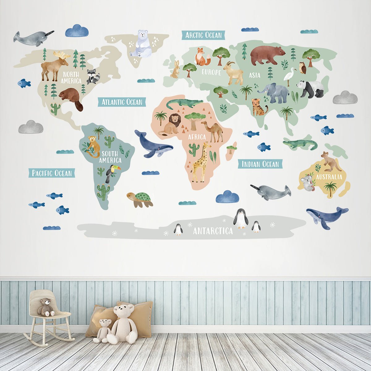
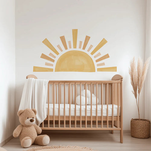
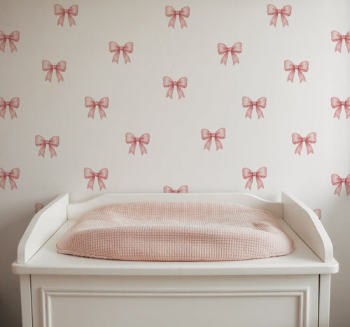
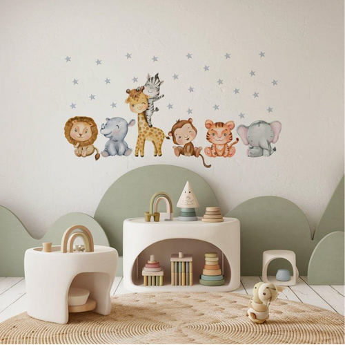
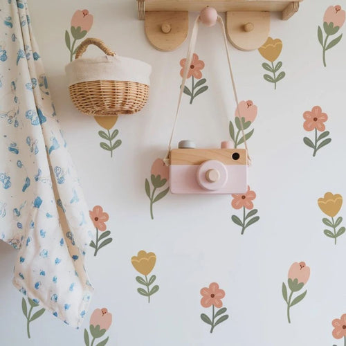
Dreamy pastel stickers use softened versions of familiar colours, including powder blue, blush pink, sage, lilac, butter yellow and warm cream. Their lower contrast gives a room a relaxed, airy appearance, which suits a sleep space or a nursery with plenty of natural wood. Soft blues, greens and neutral tones are often linked with calm sleep environments in colour psychology guidance, while warmer, brighter shades can feel more energising. Pastels are also a lovely gender-neutral option, particularly when paired with white, oak, rattan or simple monochrome accessories.
The 60-Second Decision Checklist: Choose Rainbow If. Choose Pastel If.
Use this quick check before you open another inspiration board. Picture your actual room, not a styled photograph with different windows, flooring and furniture. If you are still torn, remember that a removable decorating choice lets you follow your child’s interests without committing to one scheme for years.
Choose rainbow if:
- You want a happy feature area with noticeable colour contrast.
- The room is mainly neutral and needs a playful focal point.
- You are decorating a playroom, craft corner or shared activity zone.
- Your child enjoys bold colour, sorting games and imaginative play.
Choose pastel if:
- You want the nursery to feel calm, soft and uncluttered.
- Your furniture, cot or bedding already has plenty of detail.
- You are styling a sleep zone with natural, Scandinavian or boho touches.
- You prefer a palette that can grow gently from newborn days to school age.
The Full Comparison: Rainbow vs Pastel Side by Side

To Compare rainbow and dreamy pastel stickers properly, look beyond the colour names. Scale, finish, wall shade and the surrounding accessories can change the final effect. A rainbow may look wonderfully balanced against a plain cream wall, while a pastel design may need a pale background to remain easy to see. For furniture updates, our Check Stickers For Ikea Trofast Drawers offer a separate way to personalise the front-facing units of Ikea Trofast drawer storage with a neat check pattern.
Head-to-Head Comparison Table: Colour, Mood, Best Rooms and Best Walls
| Feature | Rainbow style | Dreamy pastel style |
|---|---|---|
| Colour effect | Several clearer shades with stronger contrast | Softened tones with a quieter visual finish |
| Overall mood | Cheerful, lively and playful | Gentle, peaceful and airy |
| Best room use | Playrooms, activity corners and feature walls | Nurseries, sleep zones and calm reading spaces |
| Best wall pairing | White, cream, pale grey or understated colour | White, warm neutrals and very light painted shades |
| Furniture pairing | Plain furniture that lets the colour lead | Wood, rattan, white and simple modern pieces |
| Decorating flexibility | A clear statement that suits playful themes | A subtle base for changing accessories |
Rainbow Stickers: The Pros and Cons
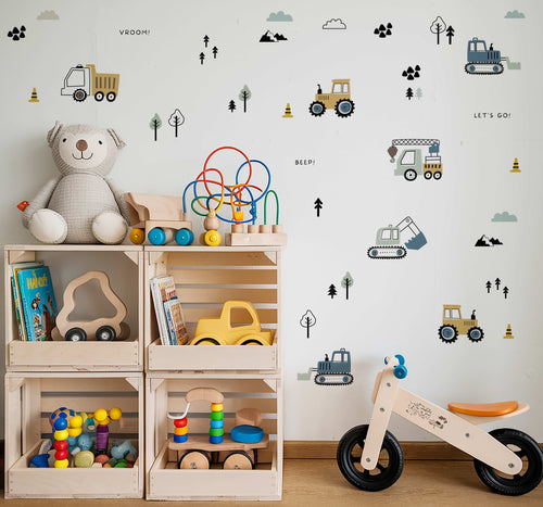
Rainbow stickers are a strong pick when the room needs personality without a full redecoration. They can tie together cushions, books, toys and artwork in different colours, making mismatched children’s belongings feel intentional. The main point to consider is visual busyness. If the room already contains patterned bedding, bright storage boxes and colourful artwork, use rainbow decoration on one defined area rather than spreading it everywhere. That creates a focal point while leaving the rest of the room comfortable to look at.
Pros
- Creates instant colour and character.
- Works well in playrooms and activity zones.
- Makes neutral furniture feel more child-friendly.
- Supports a broad, gender-neutral colour scheme.
Cons
- May feel too busy beside several bold patterns.
- Needs thoughtful placement in a small room.
- Can look less restful than softer tones near a cot.
Dreamy Pastel Stickers: The Pros and Cons
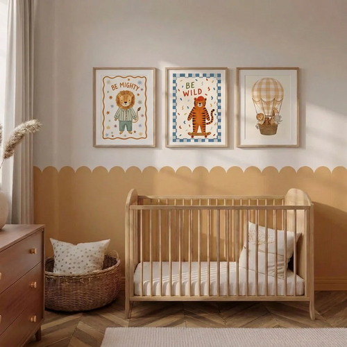
Pastel stickers suit parents who want decoration with a light touch. They sit comfortably beside linen, muslin, pale timber, woven baskets and neutral rugs, so the room can change through accessories rather than another major decorating project. Their gentle shades can appear faint against mid-tone, saturated or dark walls, so check the background before ordering and consider a pale painted surface for the clearest result. If your room has limited daylight, a slightly stronger pastel palette may be easier to see than very pale cream or blush.
Pros
- Creates a calm, uncluttered nursery atmosphere.
- Pairs easily with natural materials and neutral décor.
- Leaves room for colourful toys and changing interests.
- Offers a soft gender-neutral decorating option.
Cons
- Can be difficult to see on darker painted walls.
- May feel understated in a busy playroom.
- Very pale shades need good lighting for clear definition.
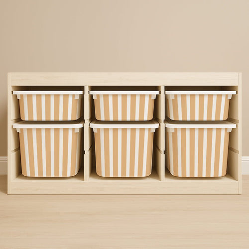
For a coordinated storage detail, Check Stickers For Ikea Trofast Drawers are designed specifically for the front-facing units of Ikea Trofast drawer storage. They are decorative accessory stickers, part of the children’s wall stickers and Ikea hack furniture stickers collection, and the product images show them applied to white Ikea Trofast drawer fronts.
Match the Style to Your Room's Light, Walls and Size
To Compare rainbow and dreamy pastel stickers fairly, look at the room throughout the day rather than judging colours from a product photograph alone. A south-facing nursery with generous daylight can carry gentle shades beautifully, while a north-facing nook may need clearer contrast to stop the decoration from disappearing. The size of the wall matters too. A full feature wall can handle a softer, repeated pattern, whereas a small alcove may benefit from one defined burst of colour.
Let the Light Decide: Bright South-Facing Rooms vs Cosy North-Facing Nooks
Bright, south-facing rooms tend to make colour feel more noticeable. Dreamy pastel stickers can look fresh and softly defined here, especially beside white furniture, pale timber and natural fabrics. Strong sunlight may also make warmer colours feel livelier, so keep the rest of the scheme simple if you want a peaceful nursery atmosphere.
North-facing rooms and cosy corners receive cooler, lower light, which can mute delicate colours. Rainbow stickers often provide the contrast needed for the design to remain visible from across the room. If pastels are your favourite, choose shades with a little more depth, such as sage, dusty blue, mauve or muted ochre, rather than the palest cream. A lamp with a warm bulb can help the room feel welcoming, but it will not change the sticker’s underlying contrast.
Which Wall Colours Suit Rainbow Stickers (and Which Suit Pastels)?
Rainbow designs are easiest to balance against white, warm cream, pale grey and gentle beige. These backgrounds allow each colour to stand out without competing with the furniture. They can also work with a soft green or powder-blue wall, provided the sticker palette includes enough contrasting shades. In a small room, keeping the surrounding walls plain helps the feature feel cheerful rather than crowded.
Pastel designs are naturally suited to light backgrounds, including warm white, oat, blush, pale sage and misty blue. Match the wall temperature to the sticker palette: cool pastels sit comfortably with blue-grey paint, while peach, butter yellow and dusty pink usually feel at home with warm neutrals. Before ordering, hold bedding, curtains and storage against the wall together. This simple colour check can reveal whether the sticker will sit quietly within the scheme or compete with an existing pattern.
Will Pastel Stickers Look Too Faint on Coloured or Dark Walls?
They can look understated on mid-tone or dark walls, particularly when the sticker includes very pale cream, blush or powder shades. That does not mean pastels are unsuitable, but the design may read as a subtle detail rather than a clear focal point. A lighter wall gives soft colours sharper edges and makes the whole motif easier to appreciate from a cot, doorway or play mat.
If repainting is not an option, test the intended area in daylight and beside the room’s main furniture. Choose a pastel design with varied shades instead of one made entirely from near-white tones. For a darker feature wall, rainbow decoration or a muted rainbow with deeper blue, terracotta and green usually offers better definition. This is also a useful way to avoid a clash: repeat one or two colours from the existing rug, bedding or toy storage, rather than introducing every shade in the room.
Three Room Scenarios: The Sunny Nursery, The Cosy Nook, The Shared Playroom
The sunny nursery: Choose dreamy pastels if the room has broad windows, pale flooring and a cot dressed in neutral bedding. The daylight will give soft colours enough presence, while the quieter palette keeps the sleep zone feeling settled. Add contrast through books, baskets or a colourful mobile that can be changed easily.
The cosy nook: In a small, shaded corner, a rainbow arrangement can create a friendly focal point without needing lots of extra décor. If you prefer a calmer finish, select bolder pastel shades and place them against a warm white wall. Keep the design above the furniture line so the nook feels open rather than visually compressed.
The shared playroom: Rainbow stickers suit a room used for drawing, building and imaginative games because the stronger contrast gives the activity area a clear identity. For a shared room with a quieter reading or rest corner, use pastels there and keep the brighter palette to one wall. To Compare rainbow and dreamy pastel stickers in your own space, sketch these zones on paper first. Seeing the room as separate moments, rather than one single colour decision, often makes the answer much easier.
Zone the Room: Why You Don't Have to Choose Just One
Choosing a nursery palette does not have to mean choosing one style for every wall. We often see the most comfortable rooms use colour according to purpose: gentle decoration near the cot, with more character around toys, books and creative play. Newborns are drawn to visual contrast during the early months, while a calm sleep setting can benefit from soft blues, greens and neutral tones, principles commonly discussed in paediatric development and sleep guidance. Your child’s room can support both needs without looking mismatched.
Calm Pastels by the Cot, Rainbows in the Play Corner
Place pastel stickers near the cot, changing area or nursing chair, where you want the eye to settle. Pair them with muslin, pale wood, woven storage and simple bedding for a restful backdrop. Keep brighter visual activity across the room, near the toy shelf or floor mat, where your child is awake and engaged.
A rainbow play corner can make a plain section of wall feel purposeful. It gives the room a cheerful anchor for books, building blocks and dressing-up games, while the sleep zone remains visually quieter. This split also helps the scheme grow with your child. Toys and artwork can become more colourful over time without making the cot area feel busy.
The Muted Rainbow: Our Signature Middle Path
If you love the energy of a rainbow but prefer a softer finish, a muted rainbow offers a happy middle path. Think dusty pink, sage, faded blue, soft mustard and warm terracotta instead of highly saturated primary shades. It gives you colour variety and a gender-neutral feel, while the lowered intensity works comfortably with oak, cream, rattan and vintage furniture.
As a parent-led design team, we like this approach for rooms that need to work hard. A muted rainbow can feel sweet in a baby’s nursery, then remain appropriate beside a homework desk or reading shelf later. For a coordinated storage touch, Check Stickers For Ikea Trofast Drawers add a check pattern to the front-facing units of Ikea Trofast drawer storage. The stickers are designed to personalise those drawer fronts and belong to our children’s wall stickers and Ikea hack furniture stickers collection.
Which Themes Pair Best: Boho and Mid-Century vs Scandi, Celestial and Vintage
Rainbow and muted rainbow palettes pair naturally with boho and mid-century rooms, where layered textiles, warm timber, playful shapes and individual colour accents already belong. Use one repeated shade in cushions or artwork to make the area feel considered. Rainbow decoration also brings personality to simple white storage without requiring a complete furniture change.
Dreamy pastels are a natural match for Scandi, celestial and vintage styling. Their softer colour story works with pale timber, boucle, linen, moon-and-star details, antique-inspired pieces and pared-back accessories. If you are mixing eras, let the wall decoration be the quiet link between them. Check Stickers For Ikea Trofast Drawers can then give practical storage a decorative check detail, helping the room feel personal while keeping its main theme gentle.
Practicalities and Your Questions: Applying, Safety and FAQs

Once you have chosen your colour mood, the practical side should feel just as easy. Removable decoration gives you room to experiment, refresh a tired corner or change a theme as your child grows. Before applying anything, check the surface, plan the layout and keep the finished design outside little hands. A few calm preparation steps can make the whole decorating job feel pleasantly simple.
Peel, Stick & Transform: Applying Your Stickers in Minutes
Start with a clean, dry, smooth surface. Dust, grease and freshly painted walls can affect adhesion, so allow new paint to cure fully according to the paint manufacturer’s instructions. Lay the stickers flat first and arrange the pieces on the floor, using low-tack masking tape to test the spacing. This helps you judge the composition beside the cot, shelving, artwork and furniture before anything is fixed in place.
- Prepare the surface: Wipe away dust and allow the area to dry completely.
- Plan the arrangement: Check the position, spacing and height from several viewpoints.
- Peel gently: Separate each sticker slowly, taking care not to crease the design.
- Stick from one edge: Smooth the piece gradually across the surface to reduce bubbles.
- Press lightly: Run clean, dry fingers over the edges so the design sits neatly.
Work slowly rather than trying to finish the room in one rush. If a piece is slightly misaligned during application, lift it carefully and reposition it before pressing it firmly. For a furniture update, Check Stickers For Ikea Trofast Drawers are designed specifically for the front-facing units of Ikea Trofast drawer storage. They add a decorative check pattern to white drawer fronts, giving a toy-storage area a more personal finish.
Clean Removal: No Paint Damage, No Lost Deposit
When you are ready for a new look, begin at one corner and peel slowly back over itself rather than pulling sharply away from the surface. Gentle removal gives you more control and helps reduce stress on the paint. Surface condition, paint quality, drying time and the age of the finish can all affect the result, so test one discreet area first, especially in a rented flat.
Keep the original backing paper if you may move the stickers to another suitable surface. Do not use sharp tools, harsh cleaners or excessive heat to prise them away. Renters can check the current product price in £ before ordering and compare that small decorating cost with wallpaper, paint, tools and the time required for a permanent change. Always follow your tenancy agreement and landlord’s decorating guidance.
Safety in Baby Rooms: Materials and Placement Near the Cot
Decorative stickers should be placed where your baby cannot reach, pull or chew them. Keep designs well above the cot, changing table and any climbable furniture, and inspect the edges occasionally as your child becomes more mobile. Never place loose pieces, packaging or removed stickers within reach. Follow the product’s care and application guidance, and ask the manufacturer if you need advice about a particular surface.
Colour can guide zoning without dictating your whole nursery. Paediatric development guidance commonly recognises the appeal of high-contrast patterns to young infants, while sleep guidance often favours a visually settled environment. You can place stronger visual interest in an awake-time area and keep the cot surroundings simple. Safety always comes before the finished photograph, so leave clearance around the cot and do not attach decoration to sleep equipment.
Your Questions Answered: Overstimulation, Gender-Neutral Style and Longevity
- Are bright rainbow colours overstimulating for babies at bedtime?
- Bright colour is not automatically a problem, but a busy, high-contrast design directly beside the cot may feel less restful than a quieter backdrop. Keep bolder decoration in a play zone and use softer surroundings near sleep time.
- Are rainbow and pastel designs gender-neutral?
- Yes. Gender-neutral styling comes from the palette, layout and accessories you choose, not from a fixed list of colours. Rainbows can feel cheerful and open, while pastels can be paired with blue, green, yellow, cream or lilac without assigning the room to one gender.
- Will the design last from newborn days to school age?
- It can, particularly when you choose a flexible motif and keep the rest of the room adaptable. Books, bedding and soft furnishings are easy to change as interests develop. Check Stickers For Ikea Trofast Drawers can also personalise the front-facing units of Ikea Trofast drawer storage as the playroom evolves, while remaining a decorative accessory for the furniture.
There is no need to make the choice feel permanent. Browse both collections, picture the design in your real room and choose the style that makes you smile when you walk through the door. Peel, stick and transform at your own pace, then enjoy a space that feels made for your family. 💛
Frequently Asked Questions
What are the current sticker trends for children’s rooms?
Rainbow contrast and dreamy pastel colour schemes are current choices for children’s room decoration. Rainbow designs create a cheerful focal point, while pastel designs give a softer, quieter look. Removable decorating options are also popular because they allow families to update a room as tastes change.
What type of stickers sell the most?
Popular stickers usually feature clear colour, simple patterns and designs that suit a child’s room. Rainbow stickers appeal to families seeking playful contrast, while pastel stickers suit calm nurseries and sleep areas. Demand can vary by season, room style and current decorating trends, so no single design leads everywhere.
What are some new and trending sticker designs?
New and trending sticker designs often include rainbow palettes, softened pastel colours and neat check patterns. Rainbow designs suit activity areas, while pastel designs pair well with light furniture and natural textures. Check pattern stickers are also available for decorating IKEA Trofast drawer fronts arranged as side-facing vertical units.
Do glossy or matte stickers look better?
Matte stickers often give children’s room decoration a softer, quieter appearance, while glossy stickers create a brighter, more noticeable finish. The better choice depends on the mood and surrounding decor you prefer. Check the individual product description before ordering, as finishes can differ between designs.
What are the highest quality stickers?
The highest quality stickers are those with a clear design, consistent printing and application details that match the intended surface. For children’s room decoration, choose a style that suits the wall colour, furniture and lighting. Product pages should provide the specific information needed to compare finish, care and compatibility.
How do I choose between rainbow and dreamy pastel stickers?
Compare rainbow and dreamy pastel stickers by deciding whether you want playful contrast or a gentler backdrop. Rainbow colours suit feature areas and activity spaces, while pastel colours work well with calm nursery styling, light furniture and neutral bedding. Wall colour and natural light can affect how clearly either palette appears.
Can check pattern stickers decorate IKEA Trofast drawers?
Check pattern stickers are designed to decorate IKEA Trofast drawer fronts on side-facing vertical units. The checkered design adds visual detail to white Trofast storage while keeping the drawer unit recognisable. The stickers are decorative accessories for the drawers, not the IKEA storage unit itself.