

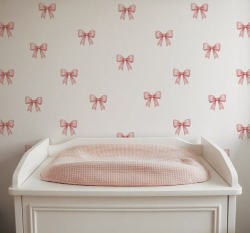
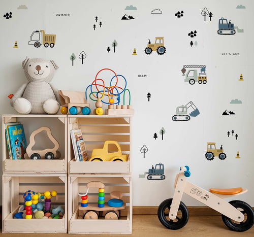
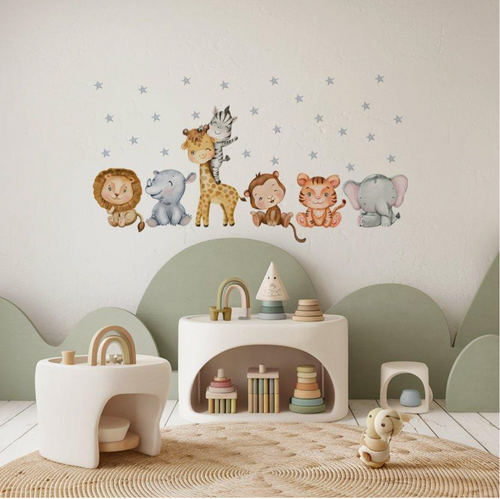
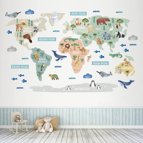

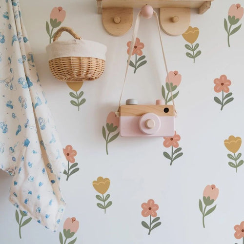
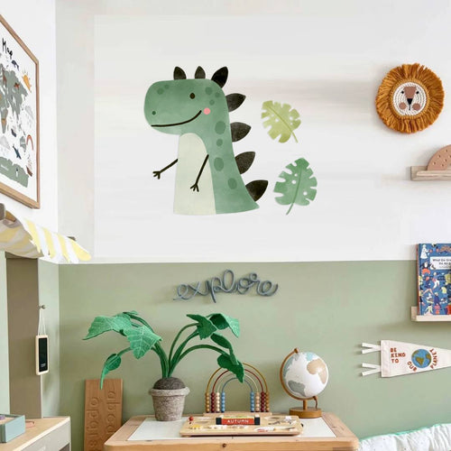
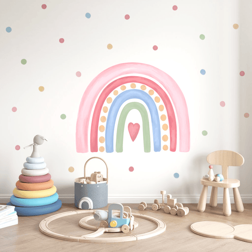
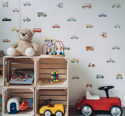

Safest floral wall art vs bold colour options.
Choosing between soft botanicals and saturated colour can feel like choosing between calm and character. Safest floral wall art vs bold colour options is not a simple question of which style is better; it’s about the mood you want, the colours already in the room and how much commitment feels comfortable.
Key Takeaways
- Soft botanical designs can create a gentler feel, while saturated colours bring more energy and personality.
- Consider the room’s existing colours and the atmosphere you want before choosing wall art.
- If you prefer flexibility, choose a decorating option that can be changed as your child’s tastes evolve.
As a mum, I know tastes can change quickly, especially in a child’s room. Personalised wall stickers offer a way to make the space feel individual without relying on a traditional mural. If you rent, check your agreement and the wall’s suitability before decorating, so your plans fit the home as well as your style.
Floral Calm vs. Colour Pop: Finding Your Perfect Nursery or Home Style
Floral art often feels gentle because its shapes and colours can echo nature, while a strong block of colour or a saturated print brings more energy to a wall. Neither choice is automatically safer or more child-friendly. A small botanical design in a deep palette may feel striking, while a bold piece with softened tones can sit happily in a restful room. Think about the feeling you want at bedtime, during play and in the light your room receives.
Consider how each option works with your existing furniture, bedding and paint. If the room already has patterned textiles, delicate florals can add detail without creating another strong focal point. If the walls and furnishings are plain, a brighter accent can give the space personality. You can also combine the two: use botanical shapes as the main theme, then pick one colour from the print for cushions or a lampshade. The aim is a balance that feels like your family, not a showroom.
How We Chose the Best Solutions: Our Decorating Criteria

We compared these styles through the details that make a room feel considered, rather than by colour alone. Scale matters: wall art should cover around 60 to 75 per cent of the furniture width beneath it, according to the decorating guidance in the research. A piece that is too small can look adrift; one that is oversized may crowd the cot or bed. We also considered palette harmony, the strength of the focal point and whether a design suits a nursery’s softer atmosphere or a playroom’s lively feel.
For families and renters, application and wall care deserve equal attention. Check product instructions and the condition of your paint before applying any wall decoration, and confirm what your tenancy allows. Our checklist keeps the choice grounded:
- Harmony: Does the artwork pick up colours already present in the room?
- Scale: Does its width feel balanced above the furniture?
- Impact: Is it a gentle detail or the main focal point?
- Practicality: Have you checked the wall and decorating permissions?
The Top Picks: Safest Floral Art & Bold Colour Decor
For a personal nursery feature with a distinctly British botanical feel, our first pick is British Floral-Inspired Personalised Names Wall Stickers. The set pairs floral designs inspired by British flora with an individual name, giving the wall a clear focal point without requiring a full-room theme. It belongs to the nursery wall stickers collection and is designed for nursery decoration. A name design can make florals feel personal, while a saturated colour choice makes a more immediate statement.
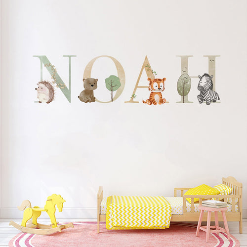
These wall stickers feature personalised names such as Luna, Sofia, Ella, Mia, Molly and Olivia in the product images. That detail can help a room feel chosen for one child rather than assembled from generic prints. Consider the wall space above the cot or bed and the colours already around it before deciding on placement. The product is also shown alongside other children’s wall sticker collections, including animals, maps, flowers, vehicles and height charts, so you can explore different themes if your child’s interests lead elsewhere. Next day delivery is offered for this product.
| Consideration | British floral personalised name design | Bold colour feature |
|---|---|---|
| Overall feel | Botanical detail and a personal name create a softer focal point. | Saturated tones bring a stronger visual accent. |
| Works well with | Plain bedding, natural textures and a restrained room palette. | Simple furniture and a few repeated accent colours. |
| Planning point | Check that the name and floral detail have enough clear wall space. | Repeat one or two print colours elsewhere to help the room feel joined up. |
| Best suited to | A nursery where you want a decorative feature with a child’s name. | A room that needs a confident focal point or a lively accent. |
Bold art does not need to clash with existing décor. Look for one shared colour between the artwork and a rug, cushion or lampshade, then keep surrounding patterns quieter. Several small bright prints can feel scattered without a larger focal point; anchoring them with one substantial piece gives the eye somewhere to settle. For a gentler result, choose floral art with colours already present in the room. Your favourite choice can also sit between the two: botanical shapes with a more noticeable colour accent.
British Floral-Inspired Personalised Names Wall Stickers is a thoughtful pick if you want the wall to carry both a floral motif and your child’s name. Bold colour is a lovely alternative when the room needs more punch; floral detail suits a quieter mood or a more personal focal point. For rental homes, review the product guidance and your tenancy conditions before applying any wall sticker. A little planning makes it easier to choose confidently, without asking every cushion and print to compete for attention.
Beyond the Print: Styling Secrets for Harmony & Impact
Scale, position and the colours around your artwork all shape how settled or striking a room feels. Above a cot, bed or sofa, aim for wall art that spans around 60 to 75 per cent of the furniture’s width. This proportion helps a focal point feel connected to the furniture beneath it, rather than too small and separate or so large that it crowds the wall.
Orientation depends on the space, not on a rule that florals must be displayed in one direction. A wide design can suit the space above a longer piece of furniture, while a portrait arrangement may fit a narrow wall or sit neatly between windows. For a display at adult eye level, the centre point is commonly placed 57 to 60 inches from the floor. In a nursery, consider the view from the doorway and the furniture layout too, so the decoration feels balanced in the room as you actually use it.
- 60% foundation: Keep the largest colour area calm, such as a neutral wall, flooring or main furniture.
- 30% supporting tone: Bring in a botanical or structural colour through bedding, curtains or a rug.
- 10% accent: Use a saturated shade in artwork or a few small details for a playful lift.
This 60-30-10 approach gives several colours a clear job, rather than asking every item to compete. If your artwork includes pink, green and yellow, choose one shade to repeat in a cushion or lampshade, then let the other colours appear in smaller amounts. A shared colour acts like a visual thread between art and furnishings. Subtle florals are not always the calmer choice: a dark, high-contrast botanical print can draw the eye, while a bold design in softened tones may feel gentle. Compare the print’s saturation with the room’s existing colours before choosing.
Gallery walls benefit from a clear anchor. Without a larger focal piece, several small, bright prints can look scattered or feel visually weak. Start with one main artwork, then arrange smaller pieces around it with consistent spacing. If the room is already patterned, leave more open wall around the display; if it is plain, you can give the art a little more company. The aim is to guide the eye, not fill every available patch.
If you and your partner are torn between gentle botanicals and a strong colour statement, agree on the mood first. One of you might choose the main artwork while the other picks a supporting colour for textiles, or you could use a floral focal point with one richer accent elsewhere. British Floral-Inspired Personalised Names Wall Stickers can suit that middle ground: the name makes the feature personal, while the botanical motif brings detail without requiring every accessory to follow the same theme. Check the wall and product instructions before applying any sticker, especially in a rented home.
Your Decorating Questions, Answered: The Nursery Stickers FAQ

Still weighing floral detail against a stronger colour statement? These are questions I hear from parents who want a room with personality but feel unsure about committing to a look. Make the choice in small, considered steps, and check the product guidance and your tenancy agreement before decorating.
Are subtle floral prints always the safer choice?
Not necessarily. A floral pattern can still feel bold if its colours are deep or strongly contrasted, while a single saturated shade may feel calm against a simple background. Choose by the mood you want and how the artwork sits beside the room’s existing colours, rather than assuming one style is always gentler.
Can I create a feature in a rental without damaging the walls?
Check your tenancy terms and the sticker maker’s application and removal instructions first. Wall condition and paint type can affect how a decoration performs, so do not assume every sticker suits every surface. If you want a personalised botanical feature, British Floral-Inspired Personalised Names Wall Stickers are designed for nursery decoration. Follow the product guidance carefully before applying them, and ask your landlord if your agreement is unclear.
How can I make artwork with several bright shades feel joined up?
Pick one colour from the artwork and repeat it in a small detail, such as a cushion, lampshade or book display. Keep nearby patterns simple so the art remains the focal point. If a gallery wall feels scattered, begin with one main piece and arrange smaller prints around it, rather than giving every print equal visual weight.
What if my partner and I prefer different styles?
Agree on the feeling you want first, then let each person shape a different part of the room. One might choose a botanical focal point, while the other picks a supporting colour for the soft furnishings. British Floral-Inspired Personalised Names Wall Stickers bring a child’s name together with British flora-inspired artwork, a thoughtful middle ground when you want both personal detail and a gentle theme.
How can I avoid art that feels generic?
Look for details that connect the design to your child, such as a personalised name or a motif chosen for their room. The British Floral-Inspired Personalised Names Wall Stickers feature customised names, helping the wall feel made for your family rather than picked at random. Take your time choosing; a room can grow around the pieces that feel meaningful to you.
Frequently Asked Questions
What is the best wall colour to display floral or bold art?
A quiet wall colour that picks up a shade in the artwork is often a good backdrop for floral or bold art. Neutral walls let saturated colours stand out, while a softer painted shade can make botanical prints feel cohesive. I’d compare the art with your room’s furniture and fabrics before choosing.
What are some good floral colour combinations for wall art?
Good floral colour combinations include soft pink with sage green, cream with muted blue, and yellow with leafy green. For nursery or home wall art, choose a palette that works with colours already in the room. Repeating one or two shades in cushions or a lampshade can help the look feel connected.
What are complementary colours in floral design?
Complementary colours sit opposite each other on the colour wheel, such as blue and orange or purple and yellow. In floral wall art, using one shade as the main colour and its complement as a smaller accent can create a clear focal point. Try echoing the accent elsewhere in the room.
How does colour influence a floral design?
Colour influences whether floral design feels gentle, restful or full of energy. Soft, nature-inspired shades often suit a quieter mood, while saturated colours draw the eye and make a stronger statement. The room’s lighting, existing furnishings and intended use all affect how the palette feels in the space.
What is the golden rule in floral design for wall art?
A useful golden rule for floral wall art is to balance its scale with the furniture beneath it. Aim for artwork around 60 to 75 per cent of the furniture’s width, so it feels connected without crowding the wall. Check the placement alongside nearby patterns and leave enough breathing room.
How can I choose between floral wall art and bold colour?
Choose floral wall art for botanical detail and a gentler focal point, or bold colour if the room needs more visual energy. Neither is automatically the safer choice; consider the mood you want at bedtime and playtime, plus your existing palette. Starting with one feature makes it easier to judge the effect.